
NICO CAMPANELLTACKI

Solo designing a 0-1 shipped solution to simplify how students receive and provide services between each other.

  • 0-1 Design
  • Product Design
  • User Research
  • Visual Identity

timeline

3 months

role

Lead Designer

User Research

tools

Figma,

FigJam

team

2 Engineers

1 Product

1 Designer

Students struggled to find services that were affordable, quick, and reliable, while service providers relied on word-of-mouth and missed income opportunities.

Discovery was fragmented across social media and personal recommendations, and booking often meant messaging back and forth without clear availability or a dependable way to assess quality for both sides. Students also had busy schedules and low purchasing power to act.

“I would rather drive 3 hours home than to try to get a haircut here”

“I paid $40 more for a haircut in Austin compared to home at a barber”

“I’ve been ghosted 6 times trying to get my nails done”

Understanding current behavior and pain points

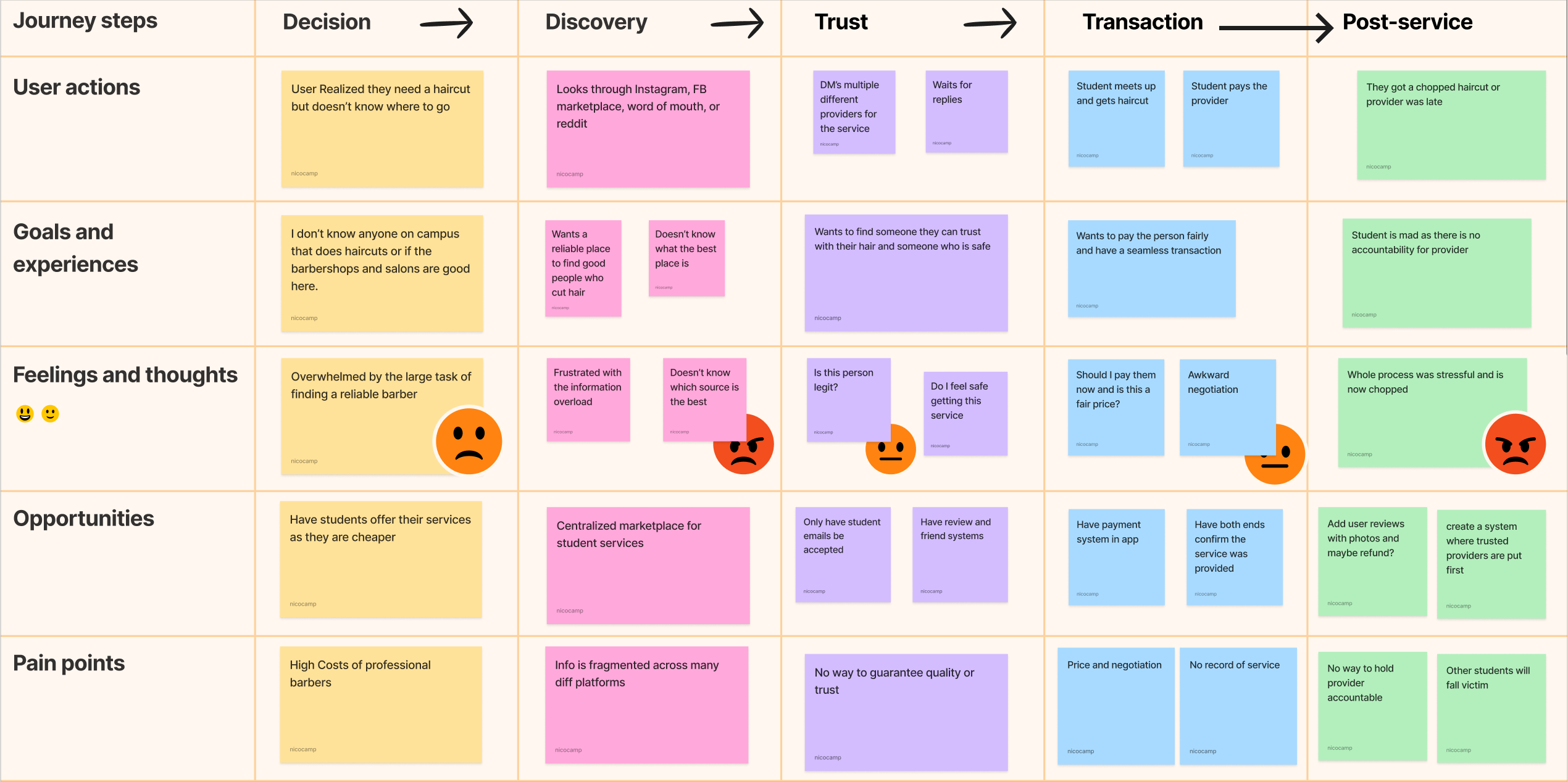
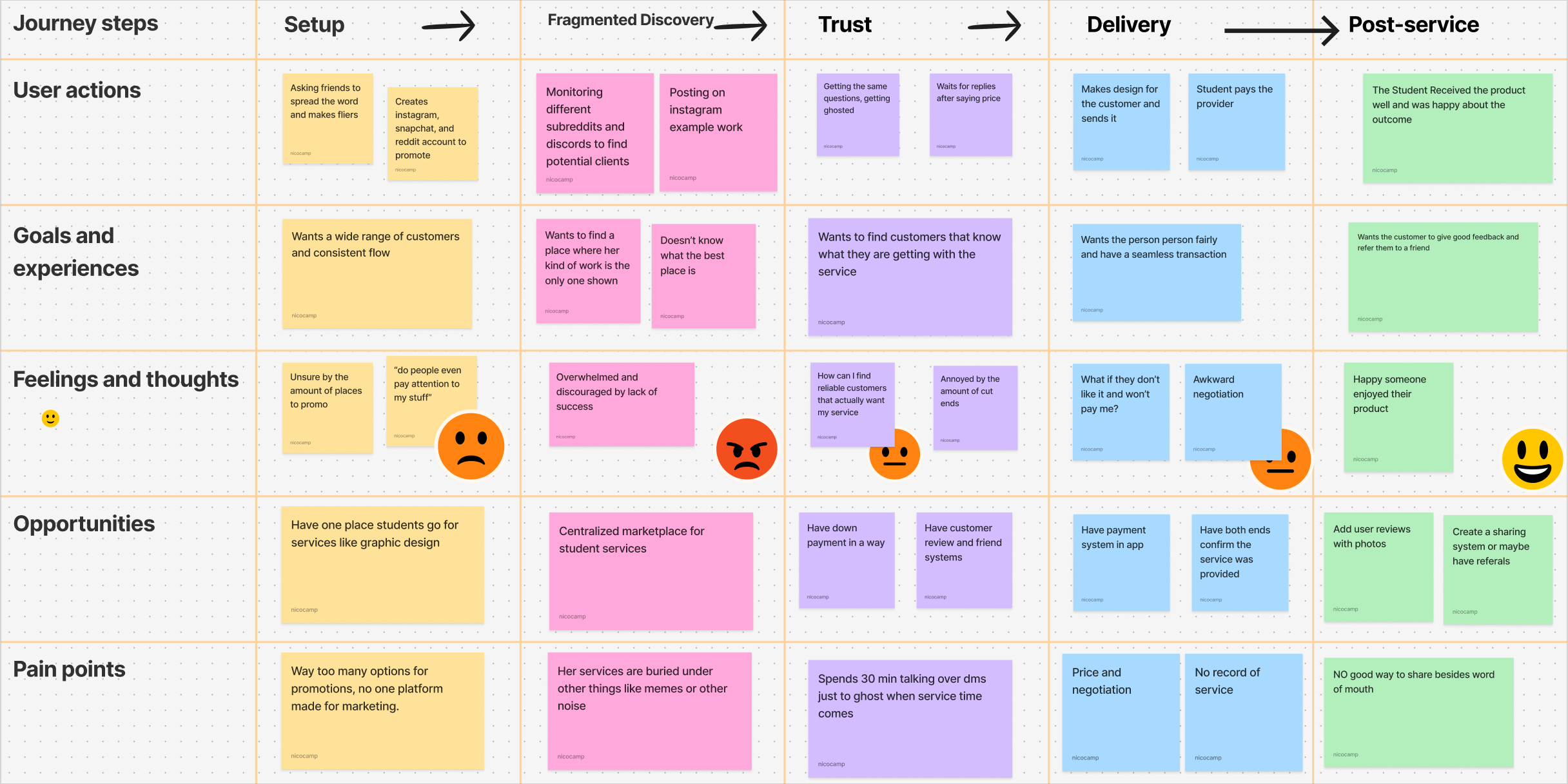
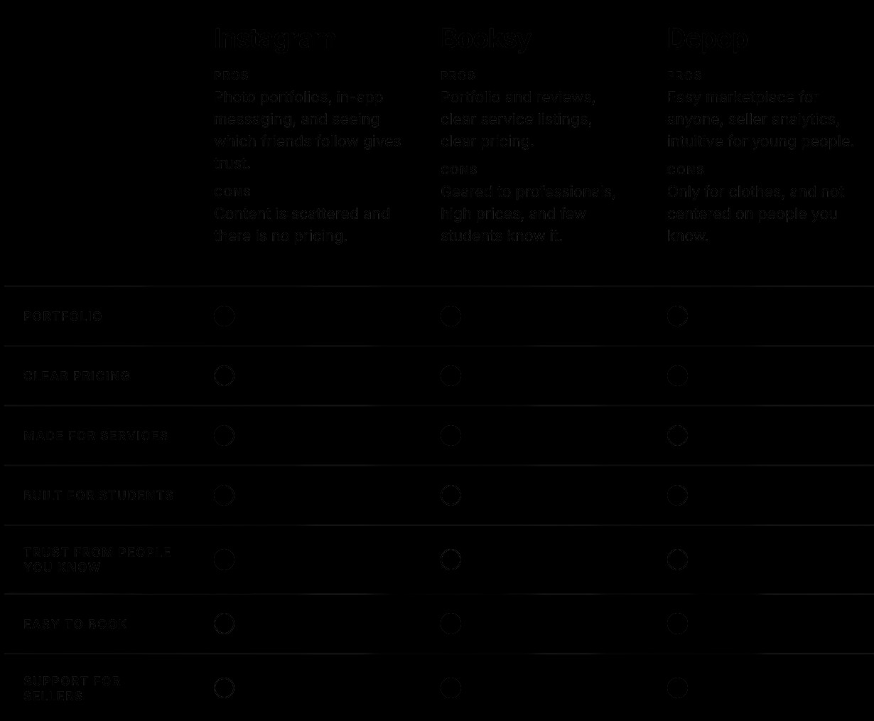
We conducted 8 user interviews, 3 competitive analyses, 2 journey maps, and 1 field study to get a better understanding of what current issues there were that were not visible at the surface.

​

Goals:

  1. Understand what tools users are already using and whats working/failing
  2. Identify potential drivers for a good user experience when getting a service provided
Journey map for students booking services
Journey map for student service providers

Journey mapping

Competitive analysis of student service platforms

Competitive analysis

Student interview notes
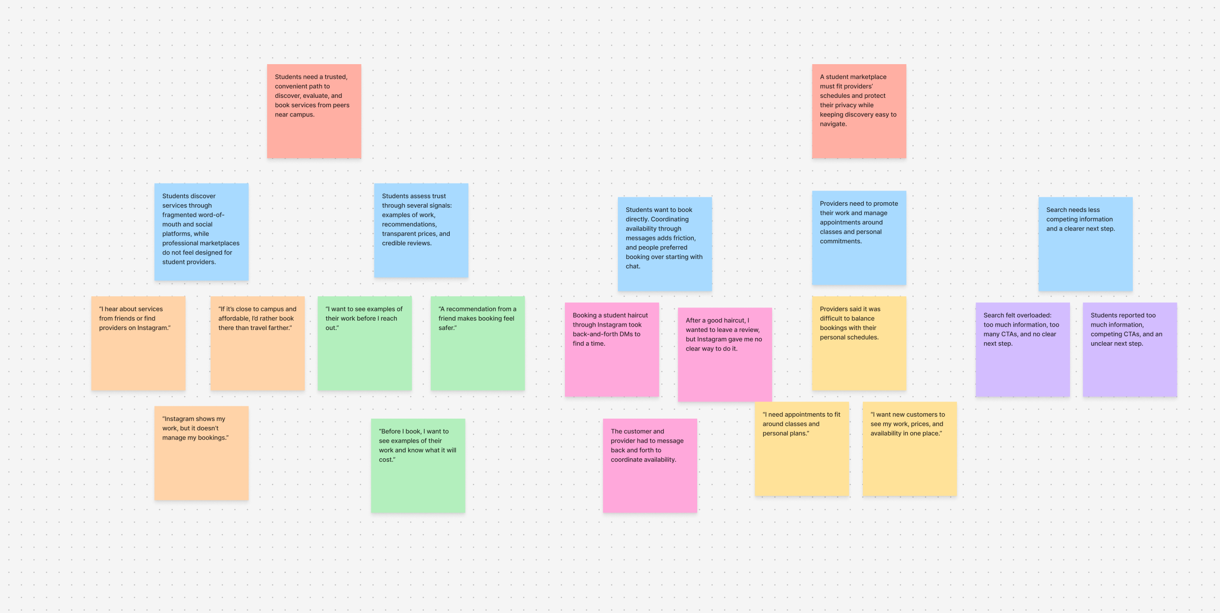
Interview findings for student service discovery
Research synthesis

Interviews

Research revealed both students’ schedules were packed and finding a time that worked was difficult; pricing was something that needed transparency; both sides need to trust each other to not cancel and to do a good job at the service; and they wished for a centralized place for all steps from discovery to booking

Insights on what mattered to students

From research we got a better understanding of the problem space, user needs and failures within the system

Trust booking services from peers they don’t know

Better discovery for services

Convenience for booking services

Providers want better outreach and tracking of service

Ideation, iteration, addressing feedback

From the insights found from research I developed several mid-fi frames and conducted user testing to fully understand what users needed and valued.

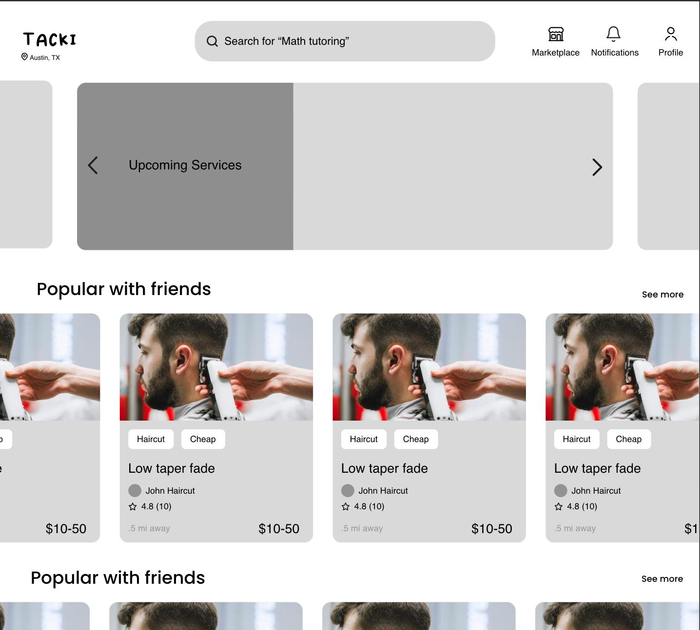
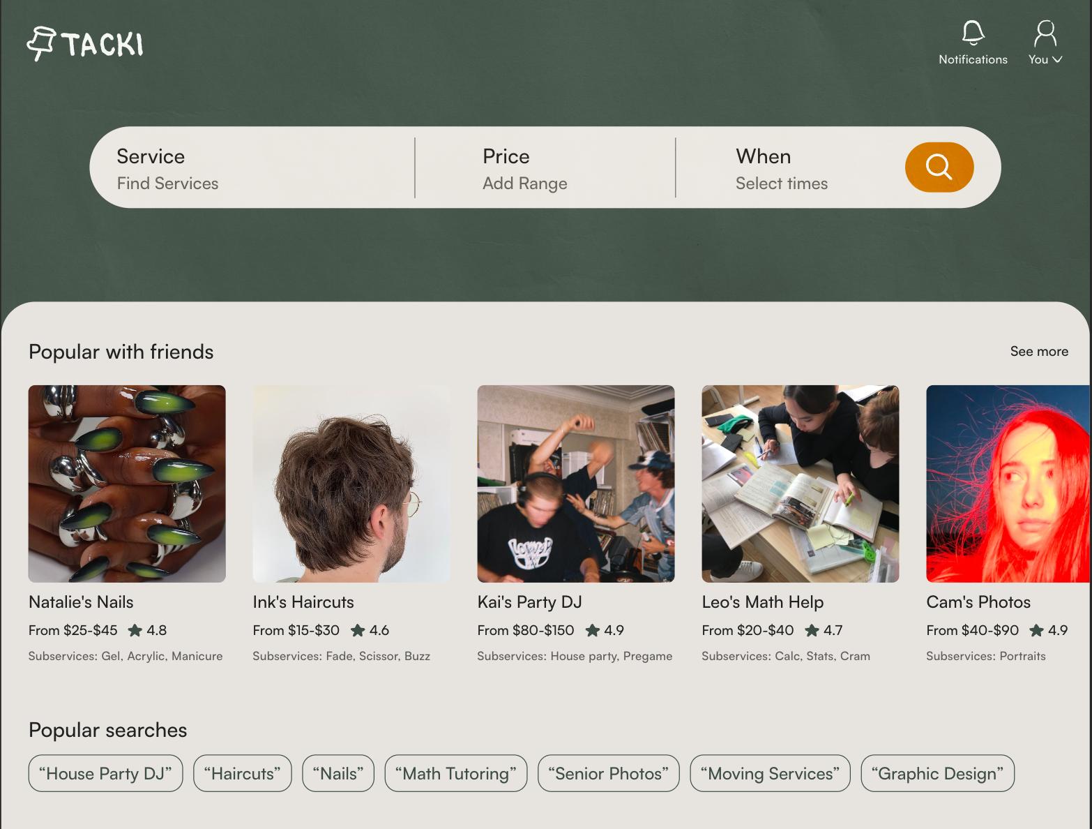
Iteration #1 - Home Page

Home page before user testing

Before:

  1. Testing found users wanted home to be for discovery
  2. Tags were not very valuable & too prioritized
  3. Cards were visually heavy
Home page after user testing

After:

  1. Search is the main action
  2. Better IA from research insights
  3. Breaks up repetitive cards

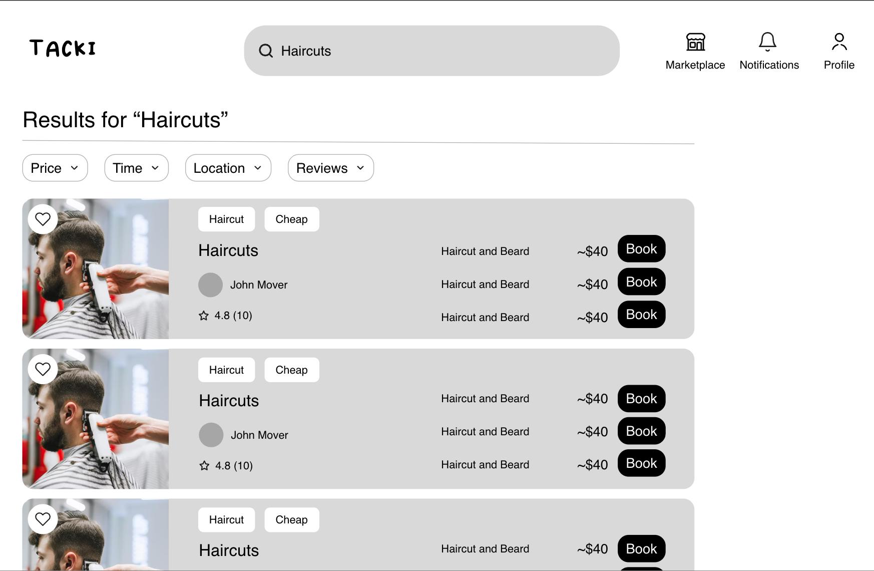
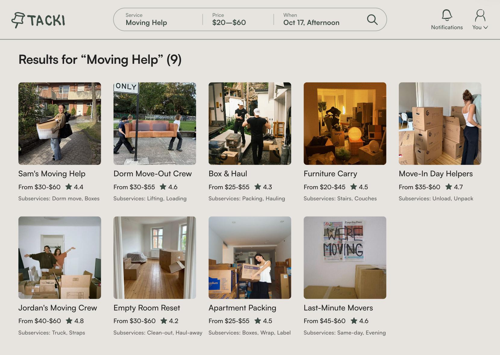
Iteration #2 - Search

Search page before user testing

Before:

  1. Too large of cards caused not enough info on page
  2. Too many CTAs caused decision paralysis
  3. “~” Created pricing ambiguity
Search page after user testing

After:

  1. Search had important filters
  2. Better IA & sizing on cards

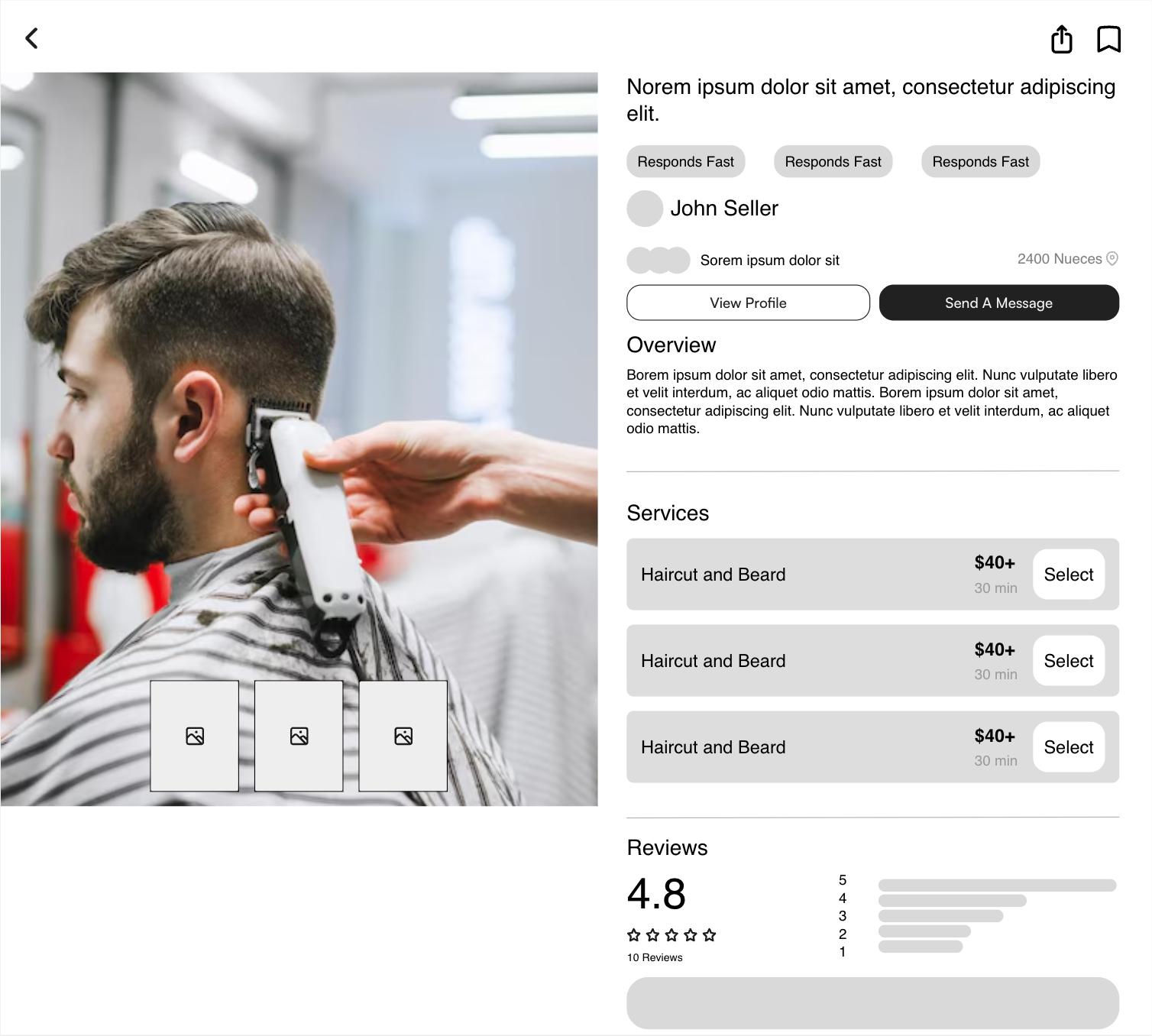
Iteration #3 - Listings

Service listing before user testing

Before:

  1. Send message was not the correct CTA
  2. Decision overload with multiple actions
  3. Only one image highlighted
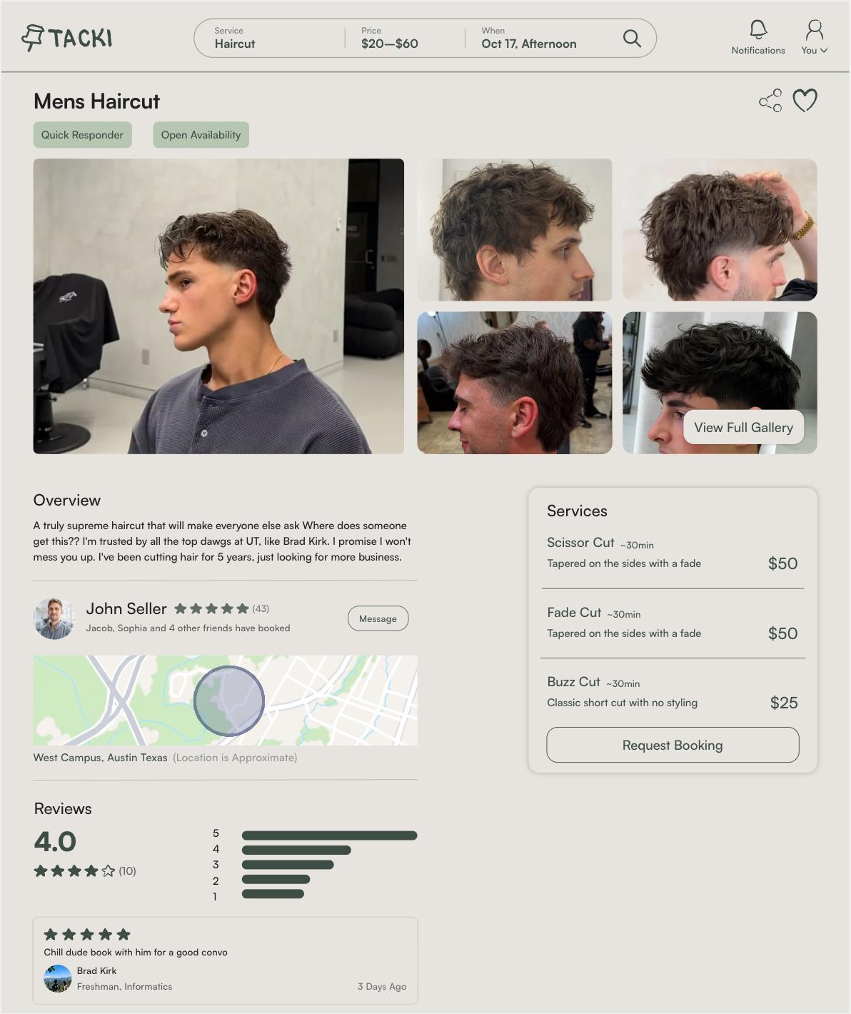
Service listing and booking after user testing

After:

  1. Gallery allows for a better view of the portfolio
  2. Added trust with friends booked
  3. Location added for ease of use but kept privacy

Figuring out what worked & what we needed

During ideation and prototyping there were a few design decisions I had to fight for or take a deeper dive into based on research insights

#1 Balancing Convenience with Privacy

Optimizing for customer's convenience could come at the expense of the provider's privacy. I redesigned the listing location section so it had a radius instead of an address and once confirmed with the provider it will have the exact location.

PrivacyConvenience

#2 Building a flow that had trust

Trust was the most prevalent insight in research. Trust wasn’t a single feature, but a design challenge that lived across many aspects of the app to get students to trust other students they don't know with services.

  1. User concern

    “Is this actually another student?”

    Trust mechanism

    University email verification

    Design rationale

    Establishes university affiliation

  2. User concern

    “Can this person do the job?”

    Trust mechanism

    Provider portfolios

    Design rationale

    Makes experience and work visible

  3. User concern

    “Have others had good experiences?”

    Trust mechanism

    Reviews

    Design rationale

    Provides social proof

  4. User concern

    “Can I clarify details before committing?”

    Trust mechanism

    In-app messaging

    Design rationale

    Reduces uncertainty through communication

  5. User concern

    “Does anyone I know recognize this person?”

    Trust mechanism

    Friend connections

    Design rationale

    Existing social relationships build familiarity

#3: Designing for students who are providers and customers.

During development the product manager, and engineers originally wanted the user flow for signing up to be a provider to be when you already were logged in and you would have to complete another flow.

However, I challenged this advocating for the there to be no separate onboarding for providers. I talked to providers and similar apps like Depop and Facebook Marketplace where users are both customers & sellers. With this information I worked with my product managers & engineers to create a flow that allowed anybody to have a selling profile to initially become a seller where all you had to do was create a listing.

CustomersSellers

What I landed on

Home to search

Booking a listing

Messaging

Stats

Log in with .edu

What I learned and whats next

Learnings:

  • Research and understand your user before designing. In my design process I made assumptions that were later proven wrong. To fully serve the user you need to understand their pain points
  • Cross-functional communication keeps teams moving. While working on this project I worked closely with my PM and engineers asking for their input on whether my designs were viable both technically and for the user.
  • Navigating ambiguity. With such a broad problem statement and multifaceted problem I had to think through each step so the user flow made sense.

Next Steps:

  • GTM strategy. Pilot beta by onboarding 5-10 student service providers and get their clients on the app
  • Continue user testing. Find and test more gaps in designs to create a better user experience
  • Establish presence on campus. Target incoming freshman without existing habits to change behavior

This is just a snapshot of the full story and my design thinking

Reach out to nicocampanell@gmail.com for the full story